Sunday, February 20, 2011
Look What I Found
I just found a whole folder of art on my computer, from 2009 and 2010, that I never posted or even organized in my pictures folder. They were taken with Natalie's camera during the time that I didn't have one. She was nice enough to find all these images, sometime last year,and put them on my flash drive which I imported to my computer and forgot about. I am not going to create a detailed post about each image but I will categorize them by time period, size, or materials so that it makes a little bit of sense.
The first few images were all created around the time I broke my camera in the summer of 2009. They are all drawn on 18" x 24" white drawing paper and most of them are mixed media illustrations made with markers, colored pencils, etc. They aren't anything special but I thought it was worth posting.


I like this one a lot only because I made it with a two year old while babysitting. Keith's daughter who is now four liked to help me draw, and while Keith and Amber went to an Incubus concert, Izabella and I made this. She liked to draw so much so that she went into my room a few days later and ruined a drawing I was working on. In retrospect, it was a mistake to leave my bedroom door open with a huge piece of a paper and a bucket of markers and colored pencils out in the open. Kids will be kids.. The couches have seen some art as well as the walls. She loves to draw which is so cool. We created a few things together while I lived there but this is without a doubt my favorite piece we made together. I actually was over at their house two days ago and found this drawing that she created at four years old. I loved the composition of it, so I took a picture of her drawing and posted it below. Maybe I can help her make something out of it like she helped me creating the image above.


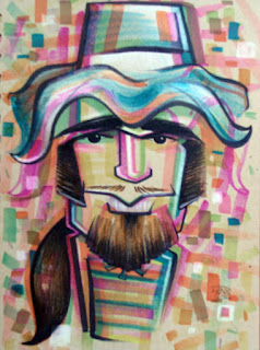
The next group of images are caricatures of people I worked with. My friends Sarah asked me to draw her and I went out of control. My girlfriend Natalie had just bought a new 7" x 10" sketchbook of recycled mid-tone paper, which I conquered during my drawing frenzy. The images that follow after are from the same sketchbook so I figured I'd include them also.


There were a few more but I wasn't happy with them. These were my favorites of the Legoland peeps. I really enjoyed drawing the caricatures above on the mid-tone paper because I got to try out some new things with grease markers combined with regular markers.
The next four drawings are just random sketches. I've never worked on mid-tone paper in fine drawing before so the caricatures above as well as these drawings were really just experiments. During my Life Drawing courses in college, we used newsprint paper, charcoal, and conte crayons to create highlights and shadows but that was a messy process unlike what I have done here. Here, I have created a little chiaroscuro, made popular by Caravaggio and Rembrandt, by adding white highlights instead of drawing around them. It makes the drawing more fun for me and more dynamic to the viewer. You will see more of this style soon.. now that I remember doing it.


The first few images were all created around the time I broke my camera in the summer of 2009. They are all drawn on 18" x 24" white drawing paper and most of them are mixed media illustrations made with markers, colored pencils, etc. They aren't anything special but I thought it was worth posting.


I like this one a lot only because I made it with a two year old while babysitting. Keith's daughter who is now four liked to help me draw, and while Keith and Amber went to an Incubus concert, Izabella and I made this. She liked to draw so much so that she went into my room a few days later and ruined a drawing I was working on. In retrospect, it was a mistake to leave my bedroom door open with a huge piece of a paper and a bucket of markers and colored pencils out in the open. Kids will be kids.. The couches have seen some art as well as the walls. She loves to draw which is so cool. We created a few things together while I lived there but this is without a doubt my favorite piece we made together. I actually was over at their house two days ago and found this drawing that she created at four years old. I loved the composition of it, so I took a picture of her drawing and posted it below. Maybe I can help her make something out of it like she helped me creating the image above.


The next group of images are caricatures of people I worked with. My friends Sarah asked me to draw her and I went out of control. My girlfriend Natalie had just bought a new 7" x 10" sketchbook of recycled mid-tone paper, which I conquered during my drawing frenzy. The images that follow after are from the same sketchbook so I figured I'd include them also.


There were a few more but I wasn't happy with them. These were my favorites of the Legoland peeps. I really enjoyed drawing the caricatures above on the mid-tone paper because I got to try out some new things with grease markers combined with regular markers.
The next four drawings are just random sketches. I've never worked on mid-tone paper in fine drawing before so the caricatures above as well as these drawings were really just experiments. During my Life Drawing courses in college, we used newsprint paper, charcoal, and conte crayons to create highlights and shadows but that was a messy process unlike what I have done here. Here, I have created a little chiaroscuro, made popular by Caravaggio and Rembrandt, by adding white highlights instead of drawing around them. It makes the drawing more fun for me and more dynamic to the viewer. You will see more of this style soon.. now that I remember doing it.


Arf Arf for Art

Good Ol' Josh coming through with even more Medeski fans. Not much to say about this one except it's someone's dog.. Never met the owner or this little guy.. or maybe this little girl but I hope you cherish it. The dog.. not the drawing. C'MON! (boom boom cchhh)
I can say that this. I used a similar technique from a more recent art piece where I used titanium white acrylic paint to accent the reflections on the eyes. I really like this method because it gives volume to the eyes and makes those reflections appear three-dimensional. I need to caution myself when using this and remember to use it sparingly. It tends to make the subject look sad which is not always an optimal depiction of someone or something; especially if they are paying you money.
Beach Fun Day in January Posted in February?

I'm backtracking a little here because these photos were taken the same day as my previous post Ten Dollar Mistake, so I figured I'd throw it in here although it is from January also. I've been working on a few things which have set me back a bit, but I'm trying to catch up.


Believe it or not but this took me around two hours to make. It probably would have been a heck of a lot easier with a plastic shovel or some sort of children's beach equippment, but my hands worked well. Natalie actually took a video of me building it and after watching it I was surprised to see how content I became with such a tedious and stressful task. I guess I just need stress.. even on a beach.
Saturday, February 19, 2011
Ten Dollar Mistake

After painting sneakers for two weeks, I was jonesin to DRAW something. Something on 80lb, my walls, arms, toilet paper,... something! I was all out of sketchbook pages and I literally couldn't believe it. For the first time in my life, I completed every random sketch pad I had laying around. What was I to do????
Then, out of no where, a beautiful white cardboard box, sitting in the middle of the room, started glowing like the heavens, demanding my attention.. It was the same box my cousin Patty had sent the sneakers in. I couldn't believe how perfect it was. There where barely any markings, besides my address and a few stamps and stickers, which could make a perfectly suitable material to create something on. I almost couldn't beleive that it was shipped from Texas and made it here without any cuts and/or bruises. It was so perfect that it began to whispered sweet nothings into BOTH of my ears.. So I got out my razerblade, cut off it's flaps, and heard it scream. boom boom cchhh
All jokes but we're having fun right? Anyway, I had nothing in mind but I did have a camera in my hand. I scoured my visual aids and found a picture of Natalie from Moonlite Beach that seemed pretty interesting. At first, it was difficult to sketch on the material thanks to the corregation sandwiched between the cardboard, but that ended up being the easy part compared to using the marker. It was pretty difficult to maintain the same weight of line throughout the entire outline. After outlining the sketch, I colored with art stix and colored pencils to finish it off.
Coloring over the corregation created a unigue texture/idea remeiniscent of the Lincoln-Wilson Effect created by the Cubo-Futurist Marceel Ducahmp's in his piece entitled Large Glass. Actually it's nothing like it but it reminded me of this. I was lucky enough to see this piece in person at The Philadelphia Museum of Art while attending the only American venue to host the major centennial retrospective exhibition devoted to Salvador Dalí in 2005. Amazing is the only word that comes to mind, but that's another story for another day.. To finish this story, I named this piece Ten Dollar Mistake because I didn't know that you can send mail in boxes that made postal stuff already on it. For some reason I thought it had to be a fresh box. I brought the box back to the post office to send the sneakers and the gentleman asked if he should try to salvage the box or get a new one. I didn't want to risk the sneakers getting damaged so I got a new box and it cost me.. You guessed, ten bucks.
Saturday, February 12, 2011
Sneakers!


Pair 1
My cousin Patty saw one of my blog entries and wanted me to make her a few pairs of sneakers for her family. Because her notes for each pair were vague, I was able to easily satisfy what each person wanted while not corrupting my artistic style. This is the first pair of four and this pair is for my cousin Austin.
Before I get into anything, I just wanted to say that I forgot much work this is. The process is sooo long and tedious. Besides dangerously stripping the clear coat with acetone, the painting has to be precise and perfect. The paint doesn't smooth as well I would like it to which adds to the difficulty of achieving this perfection. Each painted area has anywhere from three coats to five depending on the color and the underlying colors of the leather. This is why white sneakers are the easiest but dark color paints, especially the purple, are extremely difficult to get flat. The paint smooths like ink. It is very fluid and easily spreadable. One drop can cover a large area but like I said it, it doesn't look the same in all areas until the fourth third or fourth coat of paint. I'm pretty sure I already explained the process of painting leather in an earlier post so I will just highlight parts I left out last time. Here are Austin's Lacoose sneakers.


The two pictures above and to the right, both illustrate what the leather should look like after using the acetone. You must remove all of the finisher for the paint to adhere to the leather and it is a good sign when the leather begins to absorb the acetone. There will be slight discoloration from this but its nothing that the paint won't hide. Just make sure to only acetone the areas you will be painting. During painting, you will be able to see if you have done a good job stripping the clear coat because the paint will not bubble at all. If it does, start over. You will be wasting your time painting.

The two cotton balls on the left illustrate the difference between a clean cotton ball and one that is covered in clear coat. I must say, this pair was not that bad compared to some Nike Dunks and Air forces Ones I have painted in the past. This pair of sneakers needed about sixty cotton balls and took about forty-five minutes to clean.

Some areas are tight and difficult to clean using the cotton balls. These areas need a tool that are more precise and accurate. Q-tips are great because they are cheap and they can handle the pressure needed to remove the protectant. The only downfall is their surface area is small and you will need a lot of them to clean a very small area.


Over painting the eye holes for the laces was a bad idea. I had to use a Q-tip and the acetone again to remove the paint. I was too scared to go close the the edge so I had to use a razor blade to remove the access near the leather.


Stupid mistakes like these tallied up some extra time that was unneccassary if done right in the first place. I have never painted any other shoe than Nikes before and I guess you can say that it was completely different such as wateercolor paper and canvas differ. They are similar but definitely not the same.
Splatter painting of the tongue, small back portion, and laces created an interesting effect to the sneakers. My cousin wanted something abstract with blues and purples so I thought some Jackson Pollack would work.

After I painted the sneakers, I decided to dye the laces purple. They did not turn out as dark as I thought they would but the newly born lavander was still interesting. I tried matching their color in paint to unify the design. I outlined the shapes I created and accented the edges of all the planes. They turned out so 80's and I'm loving them. Let's just hope Austin does too.


Overall I am happy with them. They took a long time because this pair was sort of a trial and error piece of art. Looking back on it, I could easily replicate something abstract like this is a few hours instead on thirteen.

Pair 2
 This pair is for my cousin Patty. She said that she wanted something "girly" and that she liked flowers. I figured flowers are easy enough so I rolled with that idea. At first, I painted these shoes with Georgia O'Keefe in mind. I wanted the flowers to be blown up and abstract but it did not turn out that way. It looked terrible and I was actually scared that I had ruined them. At this point I figured what the hell... Just go for it!
Two movies later, I had something that I could work with. I did not take too many pictures of this pair in process, but I'm sure you get the picture. They are very colorful and wild. I'm not sure if a mother of two in her early forties would wear them all the time but I hope she does. If she likes them as much as the girls in the post office, than I will be very happy.


This pair of floral Nikes are easily my favorite!

Pair 3
 This pair is for my cousin's husband Jeff. He said that he wanted something colorful but he and I both didn't have anything in mind. The only thing I really know about him is that he likes to golf. When I visited them in Las Vegas, Jeff had just gotten back from a golf trip in Utah. He was so excited about the course that I decided to recreate that for him.
I googled a few images and believe that I found the exact golf course that he played on. It was very beautiful. The sedimentary rock formations were reminiscent of the Grand Canyon. They were reddish-orange which complimented the grass very well. After painting the image I found, the sky was boring. I blended three different blues to show the horizon but it wasn't enough. ..clouds!

I decided to paint the front green and add some sand traps to make it a legit golf course. And no golf course would be complete without the green and flag to locate each hole, so I added one to the outside of each shoe.


And what would be a better place to take a picture of them than on an actual golf course. I'm sorry for trespassing ;) I hope you like them Jeff.

Pair 4
 This pair is for the little guy Michael. He originally wanted a caricature of himself and a dragon but it was too hard to fit his face in the small area on the sneaker. I decided to roll with the dragon idea. First, I wanted to paint scales all over the sneaker and paint the image he desired on the toe. After painting the black, I realized how difficult it would be to create such a design on a sneaker, and how chaotic and ridiculous they would turn out. I want him to want to wear these so busy was out.
I tried matching the factory made bright green to use as a base for the dragon. This part was so difficult. I had to take an image from the internet, paint it onto a sneaker, and then transform it as a reflection. Flipping the image and making them look similar was the hardest part of painting any of these sneakers. Each color needed about four coats of paint which added to the difficulty, but I think they turned out pretty good.


The picture above illustrates the differences in coats of paint. The dragon on the left is finished while the one on the right only has two coats of paint.
I had to incorporate the state of Texas, which I painted near the back of each sneaker, because the original design of the dragon had the state around dragon as you can see in the image below. I wanted to paint the outline around the dragon but I liked how his hair blended into the sneaker so I didn't. I also had to flip this image too so the state wasn't backwards on one of the sneakers. Definitely the most difficult pair out of the four.


I love how smooth and simple these appear. They look like he could have bought them compared to the other sneakers that are obviously custom and different. I think you''ll like these Michael.
In conclusion, LOL, although this process of painting sneakers is tedious, I still do enjoy it. It was a fun project that helped me train my eyes and refined my painting skills. Thanks again to my cousin Patty and her wonderful family for buying sneakers and trusting me to paint them. You guys are the best. And to whoever you are, thanks for reading such a long post. You're pretty cool too I guess.
Subscribe to:
Posts (Atom)
DLyonsArt@gmail.com

- The Art of Daniel Lyons
- ART ART ART ART ART ART ART ART ART ART ART ART ART ART ART... ART!!! SHHH!!! (aaaaarrrt)
Featured Sites
-
-
Hand Lettering - For work I've been practicing and learning about typography and so this weekend I worked on several hand lettered pieces for fun. I was also playing w...
 8 years ago
 -
Art, Art, Art, Art... - Lead singer Mike Hranica from The Devil Wears Prada. (Graphite, prismacolor pencils and a white ink pen) A man's best friend: Chewbacca (Graphite and whit...
 8 years ago
 -
-
Communication. - Why, heeeeelllllo there. I'm feeling a bit silly tonight! Maybe it's due to all the blustery wind outside, or maybe it's because Rachel, of Rachel Pfeffer ...
 13 years ago
 -
-


You are Now a Red Blip
Thanks for Stopping By
