Thursday, November 17, 2011
Bay Whatch
This piece was inspired by the Flemish mannerist style and the work of NJ artist Jay Adler. Mannerism encompasses a lot if different styles from the 15th century ranging from true realism to foreshadowed figures that look quite odd in certain positions. The flems contorted figures in an extreme way which broke away from the traditional realism of the times. They were innovators during a time when people were set in their ways especially in the arts. This is the type of of art I enjoy. Thought provoking wildness that breaks rules..
(Why am I not a graffiti artist?)
The artwork of Jay Adler is a great example of this. He is known in the art world as a surf artist. He paints images of surfers, beautiful waves, and scenery. This subject matter rarely diverts from this ideal, but a recent painting tells a different story. He continued to corrupt the Vitruvian Man's attributes by stylizing body parts like a funny caricature while entertaining the idea if love. His painting is of two figures; a man and a women. They are holding each other as their limbs stretch further and further around each other as if to get the strongest and tightest hold possible.. A bond.. Physical and chemical.
My creation is drawn in a very similar style but my subject is very different. I drew a basic outline and pushed the limits of each attribute to form an interesting fluid shape for each body part. I made the mistake of outlining my sketch with microns before I was completely satisfied with an idea which came back to bit me in the you know what. Near her nipples, you can see a harsh outline of a layer of hair I wanted to omit from the drawing but instead, I accidentally outlined. Unfortunately, color pencils could not hide this and I knew this before attempting to. I was positive that I didn't want this area accented and I just decided to leave it as is. I'm hoping to apply paint, oil markers, or an opaque medium to conceal these lines later but for now, and before I ruin it any further, I will leave it be.
A couple days later...
So I tried using a razor blade to shave off the areas with the unwanted marker and it lessened the blow a bit. I also used Sharpie poster paint markers to conceal the lines even more but the glossy texture created by the colored pencils negated much of this attempt. For what it is, I think it's hidden pretty well and it's not so much of an eye sore now, although it still bothers me.. A lot. Overall, it was a fun little project that distracted me from some mandate portion of my life so thanks Art.
Sunday, November 6, 2011
It's For the Birdz

20" kidrobot Mega Munny entitled, It's For the Birdz
I stared at this sculpture for a long while before I could actually cut, paint, design, or even touch him for that matter. He seemed extremely monumental compared to the small 7" munny which scared and excited me simultaneously. I decided to start at his base by cutting away areas of his stomach. My original 2-D design, located near the bottom of this post, called for a blunt opening with a painted surface much like wood paneling or veneer mouldings. As I started transferring my 2-D design to this 3-D sculpture, things began to change. I decided to make the positive space resemble a picked white fence to contradict the visual and emotional feel of an urban area. As I cut away areas, with an utility knife, I noticed that the upper portion of the chest took the form of a human rib cage which birthed my idea to make it all about the birds.
The bird cage lead me to believe that I would eventually put bars inside the opening and fill it with candy that people cannot get in honor of Halloween. At this point, I was going to title my work, " No Treats for Tricks!" Unfortunately this did not happen. I could not figure out a way to fabricate the bars strong enough to survive a UPS man's hands all the way to Texas, and I did not want to buy a bird cage just for the small elevating door.. boo. Oh well.. moving on.
The first pictures below were taken after my first session with the munny. I spent about seven hours completely dedicated and involved with thinking, cutting, and painting that I never documented each process. I adapted the bricks idea from my smaller munny mentioned above and I decided to make him an entire building in honor of the ten year anniversary of 911. RIP The bricks were painted using a one-point perspective to convey depth and the idea of a possible explosion or erosion. This hole would eventually be the perfect place for my bird's nest's candy dish!?


After painting all those bricks, I decided to compliment my building idea by painting the top of his head blue like a sky. After coming home from work the next day and staring at it, again; it began to look like an egg breaking through the top of the building. I liked this idea. I researched online and found a Photoshop image of a Windows-default desktop screen saver that an artist layered broken glass over. It looked awesome! Painting the cracks was difficult. It did not look anything like my intention.. broken glass or a damaged egg. I'll get back to that..
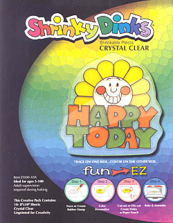
Rolling with the building idea, I decided to make physical windows in munny's back. I went to Michaels, knowing that Aaron Brothers does not sell Shrinky Dinks, to buy the some. I grabbed the only kind they had and continued shopping around the craft aisles to gather some ideas. I stumbled upon a small fake bird which would work out pretty nicely. It was a dollar or two so it couldn't hurt. I also found a small bird house, some twigs bound together like a nest, and a box of sculpey (<-- also a good time). Later that same day, my girl friend, our friend Shane, and I went to Bates Nut Farm to pumpkin pick. While searching for the most righteous pumpkin, I decided to nab some hay and use that for the nesting material within my munny. I asked the clerk to charge me a few dollars for some hay but she allowed me to take as much as I wanted which was nice. A nice pumpkin and a plastic bag full of hay ended the day.
 That night, I was super excited. I didn't know whether to build a nest or make a window. I did both. I got started on the the Shrinky Dinks first. It turns out that "Bright White" is opaque and not ideal for a window. It did not occur to me at the time, but the name now said it all. My girlfriend and I still had fun experiencing the material although we did not use it properly. Don't try this at home kids but we used a heat gun to shrink the plastic instead of a toaster or oven. Its way faster and doable anywhere. The downsides are it blows around, you'll need a suitable surface that can withstand heat, and you'll need tough fingers.. She made rings while I made a small munny I traced from the 7" Munny Comic-book. Frustrated, I called around looking for the "Crystal Clear" but I could not find this product anywhere. I had to order online and wait :(
Now that my project had a subject and an inhabitant, my ideas started taking over. I needed a drill. My boss was cool enough to let me borrow some materials from work. He lent me a heat gun, embossing powders, alcohol inks, a small piece of acrylic, and chalk inks, almost all of which I am unfamiliar. Oh, and a cordless drill. I planned on drilling a large hole, on the top of his head, to create a Rose Window, a traditional circular window found in Gothic churches, out of a broken scrap pieces of acrylic. I planned on using the alcohol inks to create colorful stained glass while using the embossing powder to mimic the lead used around each pane of glass. It was going to be a lot of work. I thought that buying a drill bit while not even owning a drill was a little much.. and pricey too. I returned the drill to work the next day and went to Home Depot to investigate...
 ... And that's that. I scurried home excited to drill everything! The bird house was sitting next to munny as I walked in with the drill and it spoke. I am very glad it did too. Munny's head is unlike the rest of his body and unlike that of the smaller versions. I drilled and drilled and drilled but nothing was happening. It was beginning to second guess the drill. The bit had piecered through his vinyl exoskeleton but would not penetrate his insides. Foam.. I could not drill any further because the foam would not compact. I was so disappointed but very happy I did not drill the enormous hole I planned on the top of his head. I bored out the hole and smoothed it out with my fingers until I unexpectedly broke through into a hollow pocket in the middle of his head. It worked out.
I headed back to Home Depot to buy a 1/4 wooden dowel needed to build the birdhouse perch you see on the bottom right photo. I left the dowel nice and long so it would pierce through the foam on the other side of munny's head and rest comfortably inside, adding to it's support. I eventually painted bricks inside the hole, on the foam, but it looked bad. The foam made the paint look as if it were done improperly so I sprayed some silver spray paint inside his dome to dust the entire inside.


After I had shrunken my windows, I used the heat gun to soften the vinyl. Cutting into a warm munny is like cutting into butter and it made the process a lot easier than the cutting of his chest. After I had all six windows cut, I painted each from a viewer's perspective. The painted bricks, in the jams within the middle windows, create straight lines while the lines within the windows on either side conform to fake angles to create more depth. After painting each accordingly, I adhered them to munny using a hot glue gun. The windows in his back were not too much trouble. I just made the window a little larger than the hole, like a rabbit to a frame, and painted over the excess from the inside.


 Tags. Munny took the shape of a plain and boring building uninterrupted by the rattles of skilled craftsmen. I am no graffiti artist but I really do appreciate the art form. It is amazing what some people can do with a spray can and a set of caps. I never tagged illegally but I did have a very large window in my backyard that my buddy Steve and I used to hit up. I enjoy spray painting but it's just so messy. This was a relatively clean water-based expression. I develpoed small tags and characters to enhance my idea of an urban building. I wrote things like, "Adult Human" to poke fun on kidrobot . Other words: R.Senal, Sick, Tweet, Graphiti, Memo, etc. I started running out of ideas and transplanted older drawings and art I have completed in the past such as my self portrait pumpkin carving, stick figure guy, etc. It was a cool
 'drawing' down memory lane.
 I used a product that I was unfamiliar with which is always fun, frustrating, and most of all "out of the box.". The tags and graf art were all created by chalk inks. They are non-toxic, food safe, and most importantly acid-free felt tip marker that produce super vibrant colors to attract the eyes. The pigment seems to jump off of any surface you put them.. and they go on anything! This is why places like Starbucks or Trader Joe's use these markers for their signage. They are very similar to poster markers since they are water-based and can be used on a variety of non-porous surfaces such as glass, plastic, or metal. In the back of my mind, I was very weary of what would happen to this medium during the varnishing process but I chugged along and pretended to forget about it.

'Outfected'
Right before I varnished, I gave munny earrings like I did for the 7" munny. This time I used scrap wooden dowels spray painted silver and sculpey to form a gauged hole in his ear. I guess munny needs attention too.
After using the white chalk ink marker to touch up the mourter between the bricks, I varnished the entire project in matte acrylic spray; minus the bird n hay. I also taped off the body and head to gloss the blue area (cracked egg/cracked sky/cracked glass.. "lightning"<--fighting word)
Munny Goes Electric?


All in all, it took about thirty-five hours, $100.00 in materials, and a lot of hard work. If I was working on it or not, I was still thinking about it no matter where I was, what I was doing, or who I was with. I used a ton of materials and needed particular equipment to achieve my result. Here is a list of such items.
Tools: Heat gun, drill, utility knife, glue gun, and paintbrushes. Materials: Chalk ink, alcohol inks, alcohol solution, acrylic paint, irridescent medium, sculpey, matte and gloss acrylic varnish, silver spray paint, hay, light bulb, wire, glue sticks, Shrinky Dinks, Copic Markers, wooden dowel, and miniature bird.
I really did have a wonderful time with this guy and I'm extremely sad to see him go. I just hope whoever wins him takes good care of him, Thanks for reading this monumental entry. This post took nearing as long as the sculpture did to complete. I'm tired.

Tuesday, September 27, 2011
Handmade with Love
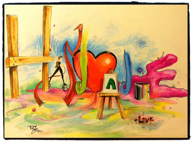
8" x 10" Mixed Media on White Drawing Paper
I think we should simplify this idea by writing out the word "Handmade" with a detail brush. It's clean and clear and under control..
Wednesday, September 21, 2011
The Race

So here is the story. My mailbox is approximitly 300 yards from where I saw him. I walked back and forth within the time it took him to create this one inch slim mark. Granted, i do walk pretty fast but being that slow really has to suck the big one.
Note to self.. 'If reincarnation does exist, opt out of snail'
Lemmi Winks brother Fezzi Winks

8" x 10" Colored Pencil on 80lbs White Drawing Paper
 A funky collaboration with Natalie. After a couple successful hand-offs of the sketchbook, this drawing started to resemble a gerbil. Lemmi Wink's cousin was born.
I'm not sure if it is done or not. I have to ask Nat but either way I had fun and I'm glad Natalie was there to create this with me :)
Call of Duty MW2 911 Playercard Art

Ps3: Call of Duty MW2 Player Card, September 2011
We will never forget
Picassoed Picasso
Well I cannot rearrange photos on this mobile blogger app so For now I will just post and I'll worry about format another day. At least I can get some art out into the world and hopefully influence someone on the Internet machine.
This small 5" x 7" pen and ink drawing is a cubist representation of Pablo Picasso. Picasso and Georges Braque were the inventors and originators of the cubism movement. Picasso, more so than Braque, is the staple to cubism and has inspired me and millions of other artists over the past century. My favorite artist Marcel Duchamp, a cubo-futurist known for the fourth dimension of art and, in my opinion, the most important piece to art, the power of titles and the ability to explain art, is included.
Anyway, this drawing was completed in three sessions. The first two photos are micons in black only. I began adding sepia microns and a white and a black prismacolor pencil near the final phase if the drawing; adding an aged look to the portrait.. Or whatever you would call it. Although it is not cubist by definition, it is still abstract enough to be considered as such. And again, I will eventually revamp and reorganize these mobile posts to be congruent with past entries. As always, thanks for checking in.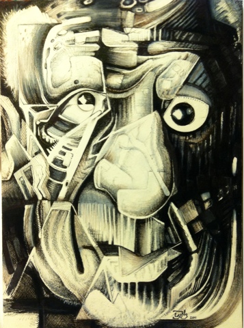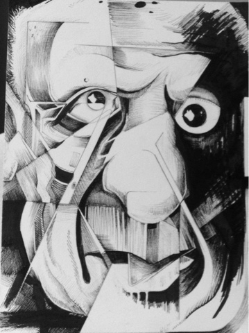
Itty Bitty Natalie
Hello folks,
It's been a little while. I'm in the process of moving and I packed my computer almost a month too early. This is why I haven't posted anything. But good news! I just downloaded the blogger app for my iPhone so I can blog on the go. I haven't explored the app so I'm not sure about providing links to references, other images, etc. I basically just want to see how this goes before I get into all that. I hope I can move images around and use my typical blog set up to keep it uniform. Let's see..
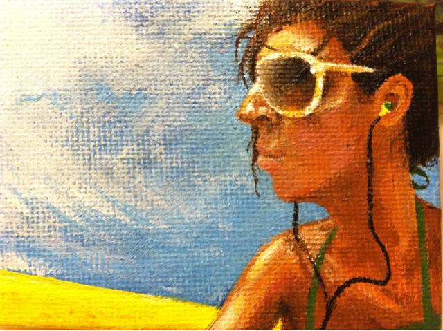
This is a tiny portrait I did of my girlfriend. I fell in love with Natalie's FB profile picture and I wanted to paint it. I had an extra baby canvas from my AB Munny project so I went for it and was very happy with the result. I will post the original image when I get my computer up and running again. Thanks for reading!
It's been a little while. I'm in the process of moving and I packed my computer almost a month too early. This is why I haven't posted anything. But good news! I just downloaded the blogger app for my iPhone so I can blog on the go. I haven't explored the app so I'm not sure about providing links to references, other images, etc. I basically just want to see how this goes before I get into all that. I hope I can move images around and use my typical blog set up to keep it uniform. Let's see..
This is a tiny portrait I did of my girlfriend. I fell in love with Natalie's FB profile picture and I wanted to paint it. I had an extra baby canvas from my AB Munny project so I went for it and was very happy with the result. I will post the original image when I get my computer up and running again. Thanks for reading!
Wednesday, August 10, 2011
Munny For AB 83 (Lost in the Ozone)
Mixed Media on 7" kidrobot Munny
This was probably the coolest hing I got to do at work so far. My boss gave me the task of designing a Munny for our new sale coming up in September. The "Artrageous Sale" is deeply rooted in graffiti and urban style art. All of our signs and window clings are graffiti and we now sell Montana Gold spray paint and several of these sculptures. There are several designs but all are soft vinyl toys made by kidrobot that artists can paint, draw, do whatever to. It's a design-it-yourself art project. You can check out more Munnys.. Munnies here and also here.
I started this project with Sharpies markers, drawing what cities lack the most.. trees. The trees, without leaves, eventually turned into vines and roots which represented growing up. Although it looked cool, this black and white version was not what I wanted. I guess I was on autopilot and ended up wasting a couple hours because I painted over most of it the next night. I wanted something that embodied the urban life I remember seeing back east. It needed brick walls and graffiti... An old feel reminiscent of NYC in the 80's where graffiti began.

To get into the feel of urban art and graffiti, I decided to watch Paid in Full. Its a movie depicted in the 1980's about a few drug dealing friends that grew up in the rough area of Harlem and deal with the problems and casualties of living such a lifestyle. The movie gave me some inspiration to start painting.. RED!! The acrylics I used are not artist quality but this worked to my advantage. A single coat of this cheap paint acted like a transparency and allowed the marker detail to shine through. They are not as opaque as the heavy body Liquitex which I normal use. This allowed me to keep the roots on his right leg which is the only portion of the original design that I liked.
 That movie reminded me of the only time I was in Harlem walking around and it was pretty scary. Granted I was there to see a Jousha Johnston painting in a YMCA during the middle of the day, with two super awesome white lesbian women in their 40's. It sounds like a dream but I swear it's true. I was taking an African Art History class at Kean University at the time and the trip was required. I remember coming out of the subway with my classmate Maria and her girlfriend and being instantly overwhelmed. We asked the first person we saw for directions to the YMCA and the Harlem Museum. Although I didn't trust the person we asked, he was right on the money which made me feel terrible. Sorry guy with one tooth more than a baby.
  After the gun busts and ganstas in the movie, I drew the target on his back and painted The United States on his head to represent other countries'
I expected this digital piece to have a transparent background and I did not know that JPEG files automatically insert a white background when saving. I had to go back in the cheap way and magic wand everything that reappeared. It looks pretty terrible compared to the original Photoshop image that I saved because the areas that were transparent are now opaque.. (obviously) Oh well. I wasn't going to waste anymore time on this. If I only saved it as a PNG file instead of a JPEG, I would have been able to keep the transparent background.. Who knew?
Fun facts: The term "zoned" or "zoned out" derived from a 1970's phrase "Lost in the Ozone" which I found to be quite appropriate for this blog posting. There is my title.. Boo-ya!
*FYI The Aaron Brothers in Midway, CA is having five world renown writers tag their windows live on August 13th from 1PM-5PM. This promotional event is free and will benefit the Boys and Girls Clubs. CLICK HERE for more info. Do it, Do it, do it..
One Lace, One Love

This is an old post that was lost.. not in translation.. but in relaxation. This image is also referred to in the post prior to this one (Natalie Meets Tom). I couldn't post this at the time of completion because it was before Father's Day and I didn't want to ruin the surprise. This is why I forgot about these last two posts.
This commissioned project was for my friend's wife. She wanted a Father's Day gift that meant something special for my old friend Hanks. She told me how she felt about him in a short paragraph and I took it from there. Being sneakerheads, I figured nothing could be better than sealing their love in a drawing of some kicks. I knew that they both loved Jordans so I found out which ones exactly and took it from there. At this point, I made each person represented by a sneaker. I made a few minor tweaks to the design. I changed the hologram from a circle to a heart on the red/whites, and wrote "Love" instead of "Jordan" near the toe of the grey/blues. The one lace travels around each sneaker and weaves into and out of each to represent two people and two minds into one life and one idea... This metaphorically speaking represents their life together and how things truly change when you are in love and start a family together; two people joined as one.
Jamie, Hank's girl and the commissioner for this piece, wanted her words to be written in the background of the drawing. Without disrupting the composition, I was able to incorporate her beautiful words into the laces that join the two sneakers together. I really like the way this came out. My favorite part being the open white spaces, on each shoe, that seamlessly blend into the background. My one quarrel with it is the toe portion on the grey/blues. I didn't think about it I guess, and I drew each sneaker from one picture. The sneaker design is actually different between colors and the red/whites have that triangle shape of the toe while the grey /blues do not. Oh well. What's perfect? I hope you like it Hanks!!
Natalie Meets Tom (Donated to The Need)

This drawing is in lou of another drawing that I can't disclose of at the moment. All I can say is that it's a sneaker which got me thinking. Feeling frisky, I decided to design an image to paint.. Well paint on.
A couple months ago, I applied for a job painting sneakers for Tom's. Art degree and all but still couldn't generate a response. Sucks for them right? I have never owned a pair, but I love the simplicity and the relaxed faux hippie, classic slip-on style. I'm fitting puzzle pieces back together as we speak.. Maybe it's because I went to one of their sneaker painting events my second day in California with my buddies Yon and Joe. My friend was in cahoots with a company called eVocal, which basically was a team of local artists in Costa Mesa that had a facility to silkscreen and sell their work. It was pretty sweet. They got the opportunity to create sneakers for local Newport Beach customers right in front of the store.
We hung out for a couple hours and I watched the artist receive requests and I got the opportunity to watch them flush out their ideas on customer's sneakers. I remember one of the artists maintaining but his talent and skill was that of a high school student who just liked to draw. To my surprise, his customers seemed please. I remember having the urge to paint a pair just to see what would have happened..
Anyway, this is the design I came up with. I am currently transferring this idea to the actual sneaker. I'm almost done so I'll post those pictures soon.
An American Influenced by an American Influenced by Japan

Color Stix and Markers on a 5" x 7" Red Suede Mat Board
This drawing was started by random lines from a brush pen made by Faber Castell. In the beginning, it looked like a face placed vertically throughout the center of the drawing. Coloring the face= zero fun. I became super bored and did not have my heart in it. I decided to create another beach style drawing after looking at the work of surf artist Jay Alders. My friend had commented on his painting entitled Shifting Perception on Facebook, which he awesomely donated it's profits to help Japan. This inspired me to create this and savage a suede mat board.
Although the whole drawing changed, you can still see pieces of a mans face when the drawing is sideways. The chin of this gentleman, who always seems to look like my buddy Keith, can be seen near the small wave in the back. His eyes are the two white splashes that are lined together on the right. His hair was obviously the right wave and his nose is still visible in the rounded line that flows into the rocks near the center. The dark lines are the brush pens. These pens/ brushes are pretty cool writing implements that don't smell like other markers I like to use. There are very many techniques you can create with them and I have used them many times in past projects although I have never blogged about them. If you want more information on PITT pens watch this artist on Youtube sell the s*#t out of them.
This is an old post that I had stored as a draft and forgot about. It seems that I have been doing that a lot lately which I guess is a good thing. I have created so many pieces the last few months that I am totally forgetting about them. Way to go Dan!
This is an old post that I had stored as a draft and forgot about. It seems that I have been doing that a lot lately which I guess is a good thing. I have created so many pieces the last few months that I am totally forgetting about them. Way to go Dan!
Friday, August 5, 2011
1000 Times

Mixed Meida on 5" x 7" Green Textured Mat Board
Relapse.. Thats all there is to say right guy? "Nah, you can also say quiting is easy. I've done it one-thousand times." -Skull
Dripping Wet

Colored Pencils on 5" x 7" Red Suede Mat Board
Okay. So, the portrait I did of Natalie was fresh in my mind. I tried drawing her again from memory with a crazy twist. Natalie has a crazy fear of liquids.. Not really liquids per say but one in particular.. spit!! I don't think anyone is really a fan, but Natalie has a profound disgust regarding spit and freaks whenever she hears a lugey hacked or sees one on the ground. I actually researched this and a lot of people have this phobia that doesn't even have a title. Someone on yahoo said it could be "sialophobia" since sialo is the proper name for saliva, but who knows. Either way, I drew Natalie's portrait entirely of different colored liquids to honor her hatred for spit. (Gross)
These facts are gross. Did you know that there are over 700 species of bacteria that thrive in the average human mouth. On the other hand, did you know that saliva balances out the acid capabilities of the mouth. If it wasn't there, besides providing the ability to swallow things easier, ours mouths would be so acidic that it would eat through out teeth. Even better.. apparently when you urinate, a small amount of the urine enters your mouth through the saliva glands. The website I saw that one on also said and I quote, "But that’s okay because fresh urine is cleaner than saliva." I have joined the club Nat.. ..I HATE SPIT!!!
Thursday, August 4, 2011
Bonsai 4 Yo Eye..(s)
Hey blog and the people who read you. It's been a while. I have slacked and I'm tired of it. I'm such a passive-aggressive blogger. Some days I can't get away, and others fly by into weeks without a look your way. I'm sorry for that. I'm sure you don't mind but for those of you who have been checking in here and there, thanks for that and sorry for the wait. The first thing I want to post is the newest series I have created over the last few days. I have many other words for you to eat and many other images that out date these for you to host, but these are fresh. And fresh is a good start.
*Actually, I forgot that I had this draft saved and I posted two other entries prior to this one even though the words above tell a different story. Oh well. Enjoy it anyway.. if you can read.
*Actually, I forgot that I had this draft saved and I posted two other entries prior to this one even though the words above tell a different story. Oh well. Enjoy it anyway.. if you can read.


 This was a fun little bonsai project that was inspired by my "playercard" on COD Black Ops. Your playercard is a small picture that you can create from other preset emblems, symbols, and pictures to make your card unique from everyone else's. Most people's cards are for mature audiences only. Most seem to think its funny to objectify women and animals in a pornographic way but there are some that have a 'nerdy class' and tend to build Superheros or Nintendo characters like this Youtube video illustating a playercard design. I, like this guy.. maybe girl.. keep it clean. Too clean actually.
Although this game is very graphic and emerses the user into violence and war, my playercard was quite the opposite. It was and still is a serene beach scene with a cliff and and some palm trees in siloutte with a sunset sky and large sun (will add a picture at some point). This leads me back to the point of all this..
For some reason my COD sunset made me think of Japan. I know this is very sterotypical and I do not mean to offend anyone, but my thought process is as follows.
All four are made with colored pencils/stix on various colored, 5" x 7" suede mat boards. Thanks for reading.
Portrait: Natalie Farrell's Make Up

Colored Pencils on 5" x 7" Red Suede Mat Board
Natalie and I went out to a club downtown for our friend Jesse's birthday where a photographer snapped a great picture of us together. Adri, another one of our friends, is going to cosmotology school and was nice enough to doll Natalie up in all sorts of powders, shadows, foundations.. girl stuff.. before we went out that night. I for one am a man who likes natural beauty. Although Natalie doesn't need to wear make up, Adri did a great job making Natalie even more beautiful. I decided to draw the photo Natalie stole off the club's website emitting myself from the composition. I made her face and skin almost transparent as if to capture only the make up that Adri applied to which the suede mat provided a good base to create such an effect. I enlarged her earrings to make the piece more fun. I also rolled back in time to my old caricature signature to represent a place and period when we first met, when I drew her all the time. <3
Portrait: Jacob Hemphill (SOJA)

Colored Pencils on 5" x 7" Slate Suede Mat Board
I plan to triple mat this piece Rasta style with this quote written on the top mat.
"It's a war in the middle I am,
So judge me now with your pad and pen.
Cause I'm too busy to judge another man,
I'm trying to write the blueprint for all the world to understand.."
Soilders of Jah Army (SOJA) is one of my favorite bands at the moment. They are an extremely talented reggae band out of Virginia. They came together to form SOJA in 2000, and dropped their first album entitled Peace in a Time of War in 2002. Their songs are about social, political, and environmental change. Their lyrics are empowering and Jacob's thought provoking ideals provide a clear message for their goal of equality and world peace in the near future.
“People think we write music about the earth for the earth’s sake, but its not really like that. If we harm the earth, it will reject us. For all we know, its happened one hundred times before. This place gets too hot, that’s it. Reset button. That’s why I sing what I sing - to pull us all in the same direction, the same future. Without that, we're finished. -Jacob Hemphill
P.S. If you were interested in listening to one of their songs and if you are too lazy to google, play their song above in the playlist. You won't be disappointed.
Tuesday, June 14, 2011
I Need New Glasses (Self Portrait 2011)

There is not much to say about this guy here.. except that he is an artist.. blah blah blah. Anyway, the only thing I did differently was my approach. I started this self portrait by using a colorless blender to sketch my face. Usually, during this process, I would use a graphite pencil for my sketch but I couldn't this time. On suede, the colorless blender creates easily visible lines compared to a traditional graphite sketching pencil. The blender allows for depressions to reflect light that cause highlights that are much easier to decipher. There is one problem though. You must make sure that your blender is clean of other colors. If not, just like the color stix, the blender will leave unwarranted marks within your drawing and it is not very consistent. Be careful in areas that you plan to leave.. colorless.
After I had my sketch, I used a brush pen to incorporate the darkest darks. I believe that your art teachers and college professors will or have told you that you always want to go light to dark, but this is not always the case. I figured that coloring over marker with wax is a lot easier than coloring over wax with wax. I have provided a few images that illustrates the drawings progression. This is the first time I have purposely recorded my progress so I hope it looks good.

Colorless blender sketch with unwanted markers near nose.


I used canary yellow to
outline highlights.
 Additions of white, sienna brown, and dark brown.
 Refining some areas and adding minor details.
outline highlights.


More refining of lips, mustache, and neck.
I love that it looks like an oil painting. I hate that it's creepy with realism. It's also pretty small and was difficult to be precise in certain areas with the color stix. I guess i could have used color pencils also but I didn't. Anyway, thanks for reading.. if you did.
Subscribe to:
Posts (Atom)
DLyonsArt@gmail.com

- The Art of Daniel Lyons
- ART ART ART ART ART ART ART ART ART ART ART ART ART ART ART... ART!!! SHHH!!! (aaaaarrrt)
Featured Sites
-
-
Hand Lettering - For work I've been practicing and learning about typography and so this weekend I worked on several hand lettered pieces for fun. I was also playing w...
 8 years ago
 -
Art, Art, Art, Art... - Lead singer Mike Hranica from The Devil Wears Prada. (Graphite, prismacolor pencils and a white ink pen) A man's best friend: Chewbacca (Graphite and whit...
 8 years ago
 -
-
Communication. - Why, heeeeelllllo there. I'm feeling a bit silly tonight! Maybe it's due to all the blustery wind outside, or maybe it's because Rachel, of Rachel Pfeffer ...
 13 years ago
 -
-


You are Now a Red Blip
Thanks for Stopping By
